03/11/2023

We present the new Ribinerf corporate identity, which aims to reflect the new reality of the company following the entry of Fagor Arrasate as a shareholder in June this year.
“With the redesign of Ribinerf’s corporate identity, we wanted to reflect this new milestone in the brand’s history”, says Estibalitz Arregi, Ribinerf’s commercial director, “We wanted it to mark the start of this new era with a new industrial partner, who brings new ways of doing things and solid backing”. The brand’s new logo also aims to modernise and refresh its image, to reflect its technological and innovative activity.
What does the new Ribinerf logo look like?
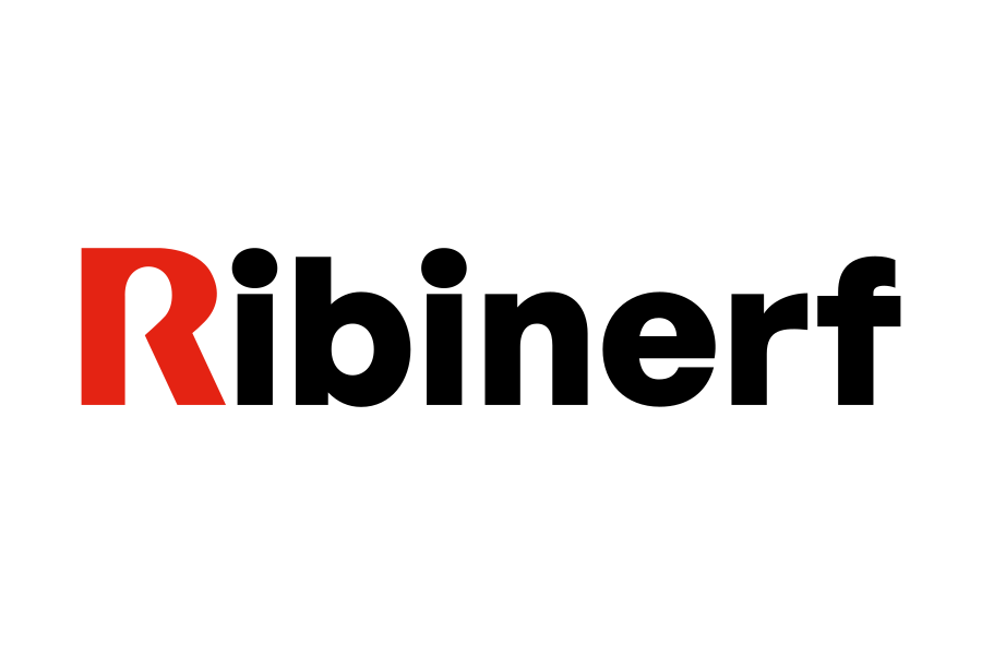
The new Ribinerf logo has been simplified as much as possible to reflect its technological DNA. It consists of the Ribinerf wordmark headed by the letter ‘R’ in capital letters, with the rest of the wordmark in lower case and in a sans serif font. Sans serif fonts are fonts with clean strokes that evoke modernity, modernity, dynamism, dynamism, strength, security, in line with the objectives set for the brand. In turn, the use of lowercase typography gives a more casual and approachable feel, and reinforces the values of agility, dynamism and modernity. The initial ‘R’ has a personalised design with straight lines, also sober and serious, as befits the brand’s activity.
For the letter ‘R’, Pantone 485 C red has been chosen, the same colour used in the symbol of the Fagor Arrasate logo, the company that will own 70% of Ribinerf’s share capital from June 2023. The rest of the wordmark is in black. These two colours, together with white, are part of Ribinerf’s brand DNA: black and white show the purity and perfection of our technology. While red conveys the passion and vitality of our personality.
With this choice of colours we also wanted to make a subtle nod to the relationship between the two brands, as they are also the corporate colours of Fagor Arrasate.

